
Page Contents and Containers
Last Updated: 29 Jan 2021
Overview
When you add certain assets in Squiz Matrix, such as a Standard Page, a few additional "dependent assets" are created by default.
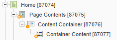
A Page Contents asset and its parent asset (a Standard Page, for example) are dependent on each other. The Page Contents cannot exist without its parent asset and it cannot be moved, cloned or linked to another asset.
Each of these asset types serve a specific purpose:
- Standard Page: Holds the main attributes and details such as the page name, status, metadata, workflow, web paths, etc.
- Page Contents: Controls the page structure/order of all the Content Containers.
- Content Container: Holds the configuration and attributes of a content block such as the HTML class, presentation type, content templates, etc.
- Container Content: Defines the type of content block, such as a WYSIWYG, Nested Content, or Raw HTML, and holds the actual content for a Content Container.
- Content Container: Holds the configuration and attributes of a content block such as the HTML class, presentation type, content templates, etc.
- Page Contents: Controls the page structure/order of all the Content Containers.
The structure of the asset is defined under the Page Contents by adding Content Containers. The content of the asset will be added into these containers.
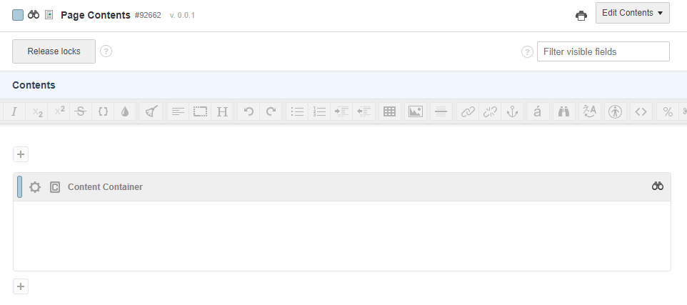
By default, a Content Container is created when the Page Contents asset is created; these Containers can be viewed and edited on the Edit Contents screen of the asset.
When you Acquire the Lock for the parent asset, it will automatically get the locks on the Page Contents and its child containers. As a container can be linked to multiple parent assets, you may not be able to Acquire the Lock on a container if someone else already has it.
In addition, the Status of a linked container will not change if it is lower than that of its other parent asset. For example, say Container-1 is linked under the Home and About Us pages, both Live. If you change the Status of the About Us page to Under Construction, the Status of Container-1 will not change and it will remain Live.
It is therefore not recommended to link containers between multiple assets.
You can also edit the content of a single container by right-clicking on it from the Asset Map, and selecting Edit Contents.
This video explains the different ways you can work with content containers.
Using Content Containers from Squiz on Vimeo.
Adding a New Container
You can add new containers to a page by clicking on the "plus" icons that sit above and below each container.
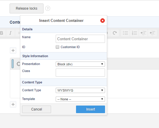 Once clicked, a pop-up will appear with some options for creating a brand new container. These are the same options that appear when you click on the Edit properties button of an existing container.
Once you have created the new container, it will also appear in the Asset Map. Once you have 2 or more containers under a Page Contents asset, you can re-order them by dragging and dropping them in the Asset Map to the desired order.
Editing the Properties of a Container
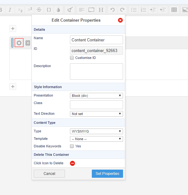 You can edit the properties of a container by clicking on the "cog" icon in the top left corner of a single container
- Name: The asset name of the container.
- ID: The HTML ID of the container. By default, this ID is automatically generated based on the asset name and the asset ID of the container in order to ensure the HTML ID attribute becomes unique on the frontend. You can however customise this by ticking the Customise ID checkbox.
Note that this is not the same as the asset ID, but rather the ID that appears within the HTML structure of the container on the frontend. For example:<div id="content_container_1234"> ...content... </div>
- Description: A short description for the container. This is also shown when the container is used as a Snippet, when listed under the Insert snippet drop down in the WYSIWYG toolbar.
- Presentation: Select the HTML tag to wrap around this container. If Raw is selected, no wrapping HTML tag will be used.
- Class: Enter any class names you want to add to this container. Note that this will only appear on the frontend if the Presentation setting is not set to Raw.
- Direction: The default direction the text will run in your container. This will set the dir HTML attribute on the container if used. Note that this will only appear on the frontend if the Presentation setting is not set to Raw.
- Content Type: Choose the content type of the container. The available options are:
- WYSIWYG: A container with the WYSIWYG Editor available to edit content with.
- Markdown: A code editing area that supports markdown code.
- Raw HTML: This type allows you to enter raw HTML into this container. You can use this content type if you want to enter any type of code such as HTML, XML or scripting code such as JavaScript.
- Snippet: This content type allows you to select from a list of pre-defined content snippets that may have been created within the system.
- Nested Content: This content type allows you to nest content from another page into this container.
- Disable Keywords: Enable this to Matrix keywords from being evaluated within this container. You can do this if you want to include text enclosed by percentage signs, which would otherwise be interpreted as a Keyword Replacement by Squiz Matrix. For example, you may wish to include the text "%New Products%" in the container.
- Delete Container: Click on the "delete" icon to delete this container.
Once you have edited the properties and clicked on the Set properties button, the pop-up will close and the container will be highlighted with blue to indicate that it has un-saved changes on it. The properties won't get saved until you save the screen itself.
Configuring the Container Display Conditions

The Container Display Conditions pop-up
To enable and set conditions on a Content Container, click on the Edit Display Conditions  icon; the Edit Container Display Conditions pop-up will appear.
The Container Display Conditions pop-up allows you to enable display conditions and configure the conditions for displaying content within the selected Content Container.
The Settings section allows you to enable conditional content on the current Content Container and define the logic to use when matching conditions.
The fields available in this section are as follows:
- Display Conditions: select whether or not to enable to use of conditional content on the Content Container. If this option is Enabled, content will only be displayed if the conditions are matched, as configured.
- Logical Grouping: select the logic to use when matching the configured Groups defined on the Content Container. The options available are:
- All groups must match: each configured Group must be matched in order to display the content of the container.
- At least 1 group must match: one or more configured Groups must be matched in order to display the content of the container.
Groups
The Groups configured define the conditions that must be met in order for the content of the container to be displayed.
By default, no Groups will be configured. To add a Group, click the Add group button; a new Group will be added to the Edit Container Display Conditions pop-up, as shown in the figure below.

The Condition Group section
You can add as many Groups as you require.
The fields available in this section are as follows:
- Logical Grouping: select the logic to use when matching the configured Conditions defined on the Condition Group. The options available are:
- All conditions are True: each Condition specified on the Group must be met in order for the group to match.
- At least 1 condition is True: one or more Conditions specified on the Group must be met in order for the group to match.
- All conditions are False: each Condition specified on the Group must NOT be met in order for the group to match.
- At least 1 condition is False: one or more Conditions specified on the Group must NOT be met in order for the group to match.
- Condition: select a Condition to use on the Group. The Conditions available in this field will be those that have been configured on the Conditions screen of the asset. For more information, refer to the Conditions chapter of the Asset Screens manual.
To add more Conditions to a Group, click the Add condition button; a new Condition field will be added.
Once you have configured the settings on the Edit Container Display Conditions pop-up, click Apply Changes. You can revert any changes you've made by clicking the Cancel button.
The  icon located at the top right hand corner of a content container indicates that the container has display Conditions applied on it. If this icon is not displayed, no Condition rules have been set.
Deleting a Container
There are two ways to delete a Container from a page:
- Click on the container asset in the Asset Map and either press the Delete key on your keyboard or move the asset to the Trash.
- Click on Edit properties (cog) icon where you can click on the Delete this container button.
Container Linked into Multiple Locations

The multi-linked container pop-up
If a Container is linked into multiple locations, the  icon will appear in the right hand corner of the Container. When you click this icon, a list of assets the Container is linked to will appear, as shown in the figure below.
When you click a hyperlink the location of the linked Container will be highlighted in the Asset Map.
It is not recommended to link containers between different assets as it can cause issues when the 2 assets are in a different status or share different permissions and/or workflow settings.