Data Source Graph
Last Updated: 03 Jan 2018
data_source_graph|asset|5.4.4.0
A Data Source Graph can be used in conjunction with the DB Data Source to display graphs of data on your site. For example, you can create a DB Data Source to count the number of asset types in your system and display the result in a graph using the Data Source Graph.
This asset can only be used in conjunction with the DB Data Source. For more information about the DB Data Source, refer to the DB Data Source chapter in this manual.
On PHP 5.3: version 0.8.0 of the image_graph PEAR package is required to create Data Source Graph assets within Squiz Matrix.
Bookmarks to the headings on this page:
Once you have created your Data Source Graph, you can configure the asset on its associated screens. Many of these screens are the same or similar to those for a Standard Page and are described in the Asset Screens manual. The Varieties screen is similar to the Varieties screen for an Image and is explained in the Core Assets manual. In this chapter we will only describe the Global Settings and Plots, which are different for a Data Source Graph.
Tip: The Preview screen will show an accurate view of the current graph. This section will only work, however, once you have selected the correct values for the X-Axis and Y_Axis on the Plots screen.
Global Settings Screen
The Global Settings screen allows you to configure the general settings for the Data Source Graph. The default graph that is created is shown in the figure below.
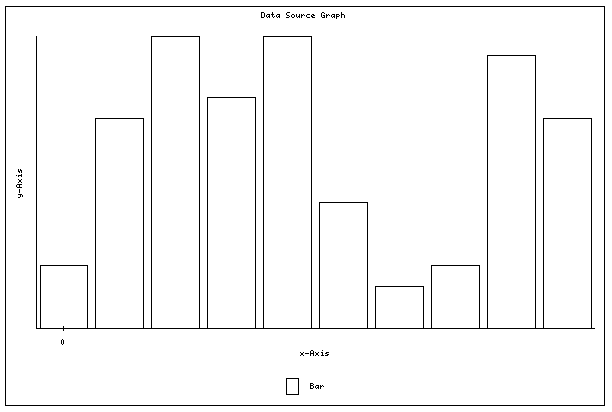
Default graph
Global Settings
The fields available in the Global Settings section are as follows:
- Width: specify the width of the graph. For example, if the width is changed to 200 pixels the graph will become narrower. The default value is 600 pixels wide.
- Height: specify the height of the graph. For example, if the height is changed to 100 pixels the graph will become shorter. The default value is 400 pixels high.
- Show the graph title?: specify whether or not to show the title of the graph. The default value is Yes. If you change this value to No, the title will not be seen at the top of the graph. The title of the graph is the name of the Data Source Graph. If you want to change the title change the Name of the asset on the Details screen.
- Title for x-Axis: specify the title for the x-axis. If you leave this field blank it will not print a title for the x-axis. The default value for the title is x-Axis.
- Title for y-Axis: specify the title for the y-axis. If you leave this field blank it will not print a title for the y-axis. The default value for the title is y-Axis.
- Label Intervals for x-Axis: specify the number of times the label for the x-axis appears on the graph. The default value is 0 intervals meaning that no labels will be shown.
- Label Intervals for y-Axis: specify the number of times the label for the y-axis appears on the graph. The default value is 0 intervals meaning that no labels will be shown.
- Angle for the graph: specify if you want the graph to run either vertically or horizontally. The example graph to the right shows the horizontal angle. The default value for the angle is Vertical.
- Angle for the x-Axis Label: specify if you want the labels for the x-axis to show either vertically or horizontally. The example graph to the right shows the vertical setting. The default value is Horizontal.
- Angle for the y-Axis Label: specify if you want the labels for the y-axis to show either vertically or horizontally. The example graph to the right shows the horizontal setting. The default value is Vertical.
- Show the legend area?: specify if you want to show the legend for the graph or not. If you change the value to No, the legend will not be seen at the bottom of the graph. The default value is Yes.
- Background Colour: specify the background colour of the graph. For example, if you change the colour to 999999 the background colour will change to grey. The default colour is FFFFFF, which is white.
- Border Colour: specify the colour of the border of the graph. For example, if you change the colour to FF0000 the border colour will change to red. The default colour is 000000, which is black.
- x-Axis Colour: specify the colour of the x-axis of the graph. For example, if you change the colour to FF0000 the x-Axis colour will change to red. The default colour is 000000, which is black.
- y-Axis Colour: specify the colour of the y-axis of the graph. For example, if you change the colour to FF0000 the y-axis colour will change to red. The default colour is 000000, which is black.
- x-Axis Font Colour: specify the colour of the font for the x-axis labels. For example, if you change the colour to FF0000 the font colour of the x-axis labels will change to red. The default colour is 000000, which is black.
- y-Axis Font Colour: specify the colour of the font for the y-axis labels. For example, if you change the colour to FF0000 the font colour of the y-axis labels will change to red. The default colour is 000000, which is black.
- Axis Left padding: specify the amount of space between the y-axis and the start of the graph. For example, the effects of changing the left padding to 50 is shown in the example graph to the right. The default value is 0.
- Axis Right padding: specify the amount of additional space to appear between the end of the graph and the end of the x-Axis. The default value is 0.
- Axis Top padding: specify the amount of additional space between the top of the graph and the end of the y-axis. For example, the effects of changing the top padding to 50 is shown in the example graph to the right. The default value is 0.
- Axis Bottom padding: specify the amount of additional space between the bottom of the graph and the end of the y-axis.The default value is 0.
Preview
The Preview section of the Global Settings screen allows you to preview what the graph will look like as you are changing the value in the Global Settings section of the screen.
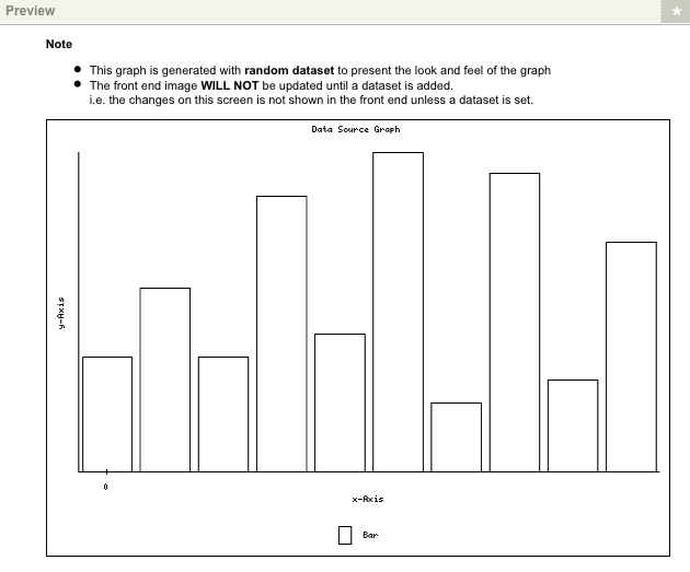
Preview section of the Global Settings screen
Plots Screen
The Plots screen allows you to specify which DB Data Source assets you want to use to provide the information for the graph, with each DB Data Source asset being added as a separate plot.
Change Mode
This section allows you to switch between adding a new plot to the Data Source Graph and editing the settings for each plot.
By default, Change Editing Mode is set to Add Plot meaning that you can add new plots to the graph. To edit the settings for the plots, select Edit Plot.
Add a new plot
This section allows you to add plots to the graphs and only appears when you select Add Plot in the Change Editing Mode field.
To add a new plot perform the following steps:
- Enter the name of the plot in the Name field.
The Name of the plot cannot be changed once it has been added to the graph.
- Select which DB Data Source to use to provide the information for this plot on the graph in the Data Source field.
- Click Commit.
The new plot will be added to the Current Plots section.
If you want to add another plot to the graph, follow steps 1-3 outlined above. An additional row will be added to the Current Plots section. You would add an additional plot if you wanted to show different sets of data on the same graph. For example, you could show one set as a bar graph and the second set as a line graph over the top.
Choose a Plot
This section allows you to select which plot you would like to edit the settings for and will only appear when you have selected Edit Plot in the Change Editing Mode field.
Each data source that you have added as a plot will appear in the list for the Choose a plot field. To edit a plot select it from the drop down list and click Commit.
If you make changes to the settings of the plot, click Commit BEFORE you select another plot from the drop down list to edit. You will loose any changes you made if you do not click Commit before changing the plot.
General Plot Settings
This section allows you to edit the settings for the plot and will only appear when you have selected Edit Plot in the Change Editing Mode field. The fields available are as follows:
- Plot Name: this field displays the name of the plot that is currently being edited. You cannot change the name of the plot.
- Display Name: specify the name of the plot that will appear in the legend of the graph.
- Data Source: the current DB Data Source that is being used for the plot is shown in the field.
- Choose x-Axis: specify which field to use for the x-Axis values. The list of fields that you can select from is sourced from the DB Data Source.
- Choose y-Axis: specify which field to use for the y-Axis values. The list of fields that you can select from is sourced from the DB Data Source.
- Choose Type Of Graph: specify which type of graph to use for the current plot. Some of the graph types that are available are shown in the figure below. Not all graph types are shown, as some require a specific set a data type to produce.Please note, to get the dot graph to work you will need to select the marker type you wish to use in the Choose The Type Of Marker field located in the Marker Settings section.
Please note, in order for the dot graph to work you will need to select a marker type in the Choose The Type Of Marker field in the Marker Settings section below.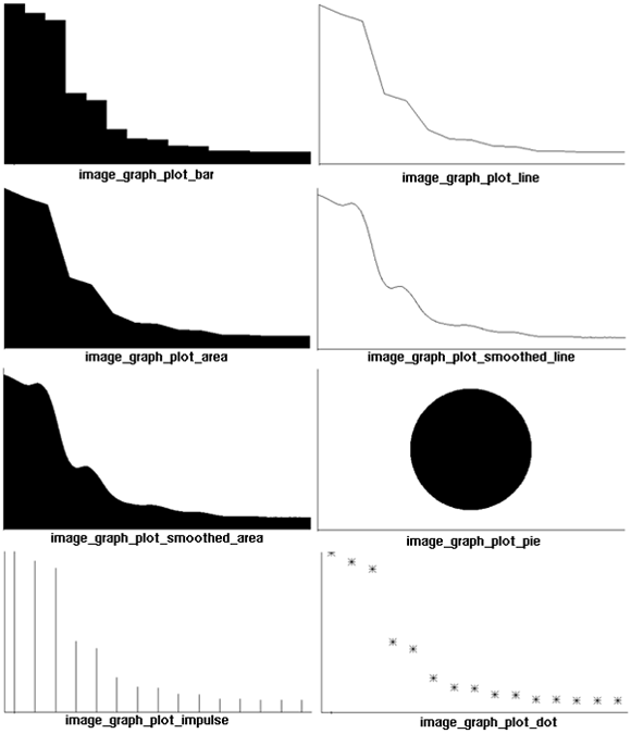
Example graphs - Accumulative?: if you select Yes in this field, the y-Axis values will be accumulated. For example, to produce the second bar on the graph, the first and second y-Axis values will be added together and the total value is shown. To produce the third bar of the graph, the first, second and third y-Axis values will be added together and the total value is shown.
- Fill Colour: specify the fill colour for the plot on the graph. For example, if the Fill Colour is changed to 999999, the fill colour of the graph would change to grey. The default colour is FFFFFF, which is white. For this field to work you must select Leave Empty in the Fill Gradient Type field.
- Line Colour: specify the line colour for the plot on the graph. For example, if the Line Colour is changed to FF0000, the lines on the graph would change to red. The default colour is 000000, which is white.
Fill Gradient Type: specify the gradient fill for the graph. This field works in conjunction with Gradient Colour 1 and Gradient Colour 2 to create the required gradient. For example if you changed Gradient Colour 1 to FF0000 which is red, Gradient Colour 2 to 0000FF which is blue and selected a Fill Gradient Type of Vertically, it would produce the graph shown in the figure to the right.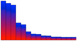
Fill gradient example- Gradient Colour 1: specify the colour for on of the gradient fill colour. This field is used in conjunction with the Fill Gradient Type and the Gradient Colour 2 to determine the colour of the graph. The default value is 000000, which is black.
- Gradient Colour 2: specify the colour for on of the gradient fill colour. This field is used in conjunction with the Fill Gradient Type and the Gradient Colour 1 to determine the colour of the graph. The default value is 000000, which is black.
Plot Specific Settings
The Plot Specific Settings section will only appear if the type of graph is either Image_Graph_Plot_Bar or Image_Graph_Plot_Area.
The fields available are as follows:
- Spacing: specify the amount of space in between each plot on the graph. The default value is 0.
Stacked: this section allows you to add another plot to the graph. You can then stack these plots on top of each other as shown in the figure to the right. To add another plot to the graph, enter a title for the new plot in the Title field, select the Data Source in the second field and click Commit. Additional fields will appear in the Plot Specific Settings section, as shown in the figure below.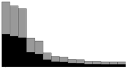
Stacked plots
Select the x-Axis and y-Axis and select the correct Gradient Details. To stack the graphs on top of each other, select the Do you want to use stacked bar graph field. If you no longer want to include the additional plot on the graph select the Delete check box and click Commit.
Additional fields in the plot specific settings section
Marker Settings
The Marker Settings section allows you to add and format the markers that appear on the graph. The fields available are as follows:
- Choose The Type Of Marker: select the type of marker to be used on the graph.
- Choose Value To be Marked On The Graph: specify which value is to be marked on the graph. By default the x-Axis will be marked.
- Set Font Colour: specify the colour of the font. This colour is used for the Mark Value For A Dataset marker type. The default colour is 000000, which is black.
Set Line Colour: specify the colour of the lines for the mark. For example, if you change the colour to FF0000 the line colour will change to red. The default colour is 000000, which is black.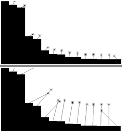
Pointer length example- Set Fill Colour: specify the fill colour of the mark. For example, if you change the colour to FF0000 the fill colour will change to red. The default colour is 000000, which is black.
- Choose The Marker Pointer: select the pointer type for the marker. The top figure on the right shows a graph that is using the angular marker pointer.
- Set Length Of The Pointer: specify the length of the line for the pointer. For example, if you change the length to 100 the line will grow as shown in the example graph to the bottom right. The default length is 20.
Single Preview
The Single Preview section shows an example graph of how the current plot looks. As you make changes to the fields above, the preview will also change.
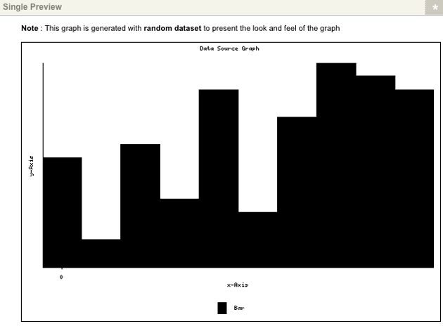
Single Preview section of the Plots screen
Final Preview
The Final Preview section will only appear if you have select two or more Data Source assets in the Add a new plot section. It combines all of the plots and shows how the final graph will look. As you make changes to one plot, the preview will also change.
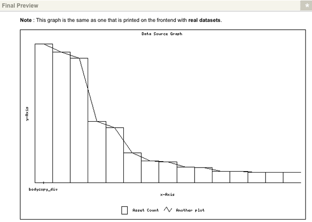
Final Preview section of the Plots screen
Example of Setting Up a Data Source Graph
Once you have created the Data Source Graph in your system, you can use it by inserting it into the content of your site as you would with an Image. To see how this works consider the example of creating a graph based on the DB Data Source created in the DB Data Source chapter, and inserting it into the Asset Listing also created in that chapter.
Creating and Setting up the Data Source Graph
Create a Data Source Graph under the site and perform the following steps:
- On the Plots screen enter Asset Count into the Name field, select the DB Data Source as the Data Source and click Commit.
- Select Edit Plot from the Change Editing Mode field and change the following values:
- Choose x-Axis: select name from the list provided.
- Choose y-Axis: select num_assets from the list provided.
- Fill Colour: enter the colour 009CDC, which is blue.
- Line Colour: enter the colour 000000, which is black.
- Choose The Type Of Marker: select Mark Value For A Dataset from the list provided.
- Choose Value To be Marked On The Graph: change this value to Mark y-Axis Values so that the count of the number of assets will appear in the marker.
- Set Font Colour: enter the colour FFFFFF, which is white.
- Set Fill Colour: enter the colour 000000, which is black.
- Click Commit and preview the Data Source Graph. You will have something similar to what is shown in the figure below.
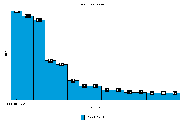
Example graph - Change the following values on the Global Settings screen:
- Title for x-Axis: enter Asset Type for the title of the x-Axis.
- Title for y-Axis: enter Num. of Assets for the title of the y-Axis.
- Label Intervals for x-Axis: enter 1 so that the x-Axis label is shown for each bar in the graph.
- Label Intervals For y-Axis: enter 10 so that the numbers on the y-Axis will increment by 10.
- Angel for the graph: select Horizontal from the list provided.
- Angle for y-Axis Label: select Horizontal from the list provided.
- Show the legend area?: select No from the list provided.
- Click Commit and preview the Data Source Graph. You will have something similar to what is shown in the figure below.
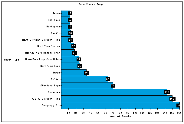
Example graph
Using the Graph on the Asset Listing
To insert the Data Source Graph into the Asset Listing, edit the contents of the Page Contents Bodycopy. Click the Insert Image icon in the WYSIWYG Editor, select the Data Source Graph as the image to insert, click OK and click Commit - the graph is inserted into the Asset Listing. When you preview the Asset Listing you will have something similar to what is shown in the figure below.
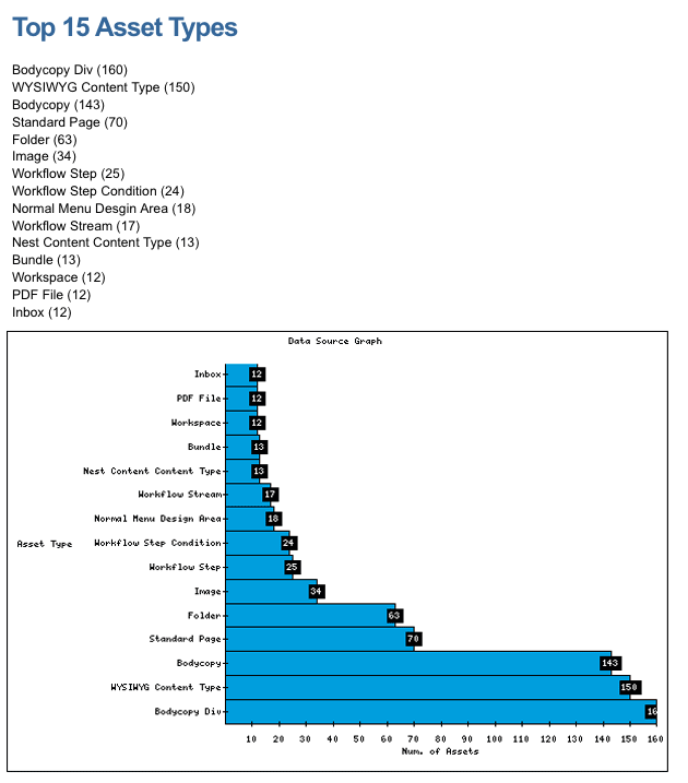
Preview of the Asset Listing
