Calendar Design Area
Last Updated: 14 Oct 2019
design_area_js_calendar_navigator|asset|5.4.4.0
This feature has been removed from Squiz Matrix as of version 5.5.5.0.
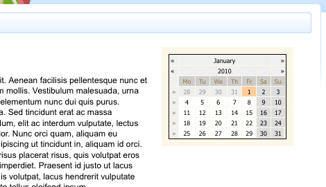
This design area allows you to display the calendar date picker within the design. When a user clicks on a date in the date picker, the system will display the associated events for the day, week, month or year.
Bookmarks to the headings on this page:
The code that is required for the calendar design area is shown below.
<MySource_AREA id_name="cal_navigator" design_area="js_calendar_navigator" />
Once you have added the code to the parse file, to get this design area to work, you need to customise it in a Design Customisation and select which Calendar Page asset to use.
Customising the Calendar Design Area
Once you have added a calendar design area to the parse file of a design, you need to create a Design Customisation and customise the design area in order to select which Calendar Page asset you want to use. For more information on how to create a Design Customisation and customise the design area, refer to the Design Customisation chapter in this manual.
Once you have customised the calendar design area, you can customise its settings on the Details screen. For more information on the Status, Future Status and Thumbnail sections, refer to the Details Screen chapter in the Asset Screen manual. For more information on the General section, refer to the Design Customisation chapter in this manual.
Calendar Options
This section allows you to customise the calendar design area.
The Calendar Options section of the Details screen
The fields available are as follows:
- Target Pages: this section allows you to select which Calendar Page to use for each view of the calendar. The views that are available are Year, Month, Week and Day. You need to select at least one Calendar Page in one of the options for the calendar to appear in the design. If you do not select a page for one of the options, when a user clicks on that view, no information will appear on the screen. For example, if you do not select a page in the Year view, when the user clicks on the year in the calendar, no information will appear on the screen.
- Element ID: this field allows you to change the id_name of the calendar design area. By default, the id_name that was entered into the parse file will appear in this field. This name must be unique for the design.
- Custom CSS File: this field allows you to select a specific CSS file to use for the calendar design area. By default, the calendar will be displayed in shades of grey. To change the colour or size of the date picker, add the CSS file as Text File in the system and select it in this field. The CSS file cannot be a CSS File asset and does not need to be an associated file for the Design.
Example
Below is the HTML code that was added to the static HTML file to show where the calendar should go in the design.
<div id="right-column">
<!-- Calendar area -->
</div>
The required code for the Calendar design area is added, as shown below.
<div id="right-column">
<MySource_AREA id_name="cal_navigator" design_area="js_calendar_navigator" />
</div><!-- end right-col -->
A Design Customisation is created and the calendar design area is customised. On the Details screen of the design area, the Calendar Page is selected in the Day view field, as shown in the figure below.
Setting the Target Pages fields
The Design Customisation is applied to the Site on the Settings screen (for more information on the Settings screen, refer to the Asset Screens manual). The calendar now appears on the right hand side of the screen, as shown in the figure below. When the user clicks on a day in the calendar, the events for that day will appear on the screen.

The Calendar on the Design of a Site
